 ★
★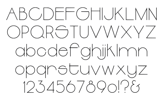
- Thinline
- Light
- Regular
- Outline

Bentley
Designer
Date
ca. 1970 ?
Foundry
Alternates
A E E Y e f m r t 1 2 3 4 5 6 7 8 9
Digial
Bentley DF by Daylight Fonts, 2010
Specimen
Alphabete/Alphabets 2 (45 Bentley Thin)
★
Bentley
Designer
Date
ca. 1970 ?
Foundry
Alternates
A E E Y e f m r t 1 2 3 4 5 6 7 8 9
Digial
Bentley DF by Daylight Fonts, 2010
Specimen


詳細判明が困難であったのフォント「ベントレー」。 60年代に活躍した Bentley/Farrell/Burnett によるデザインではないかと推測していたが、こちらを確認すると Joe Taylor によるデザインであった。 以下の広告を確認すると Arthur の焼き直しである。
BENTLY *revision of “Arthur Thinline” と掲載されている(表記では BENTLEY の Eが脱字)。
ちなみに『アイデア』No. 105 (1971年/P. 22)でベントレー/ファレル/バーネットが特集されている。
Peter Bentley, Michael Farrell and Stewart Burnett
Bentley/Farrell/Burnett
It’s funny how there are trends in the naming of design companies. Currently we have a passion for the singular and quirky : Spin, Yes, Form, Purpose, Together, - you get the idea. In the 50s and early 60s it was all a bit technical sounding, with collectives like, Design Research Unit, Planning Unit, Forum Design Unit. In the mid 60s to 70s all you had to do was slot the principal names together: Fletcher/Forbes/Gill. Churchill/Holmes/Kitley. Abis/Stribley/Sider. Negus & Negus. Henrion Ludlow Schmitt etc, all sounding like firms of solicitors or a rock group - Emerson Lake & Palmer. Crosby, Still & Nash and so on. In 1969 these three turned up…
Skin Alley – Skintight, 1973
update: