
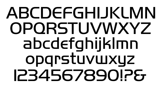
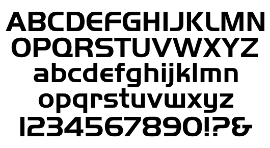

Handel Gothic
Client
Continental Airlines
Designer
Date
1965
Foundry
Alternates
B P Q R S W e r s w
Specimens
- Typony Core 3 (145 Lite, Bold)
- モンセン欧文書体大字典 (G-50 Medium / G-103 Light)
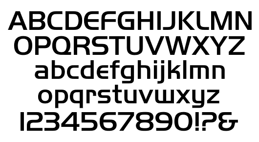
Handel Gothic
Client
Continental Airlines
Designer
Date
1965
Foundry
Alternates
B P Q R S W e r s w
Specimens


「ハンデルゴシック」は、「コンチネンタル航空のフォントをつくってほしい」というドン・ハンデルの依頼でボブ・トログマンがデザインした。 当時、ふたりはソール・バスのデザインスタジオで働いていた。
以下、Robert Trogman のブログより抜粋。
The story behind Handel Gothic is interesting and has a twist in the final result. About 35 years ago I was working with the Saul Bass (1920–1996) design studio and there was a graphic designer by the name of Don Handel. He knew that I was making fonts and he asked me to do the font for the “new” Continental Airlines logo. It wasn’t too long after that the Visual Graphics Corp. had a font design contest and Don submitted the Continental Gothic, but with a lowercase. A committee of experts rejected the design, and I became the heir to the original art. I made the first fonts and then a division of Xerox requested a lightweight version of the now famous Handel Gothic; hence, Handel Gothic Light.
Handel Gothic is probably the most pirated font family ever to be put on a computer. I have never received any royalties or even recognition for the introduction to the public.
drtype.files.wordpress.com/2011/02/dr-type-for-january.pdf
United Airlines logo by Saul Bass, 1974
Continental Airlines logo by Saul Bass, 1968
update: Mar. 5, 2019