 ★
★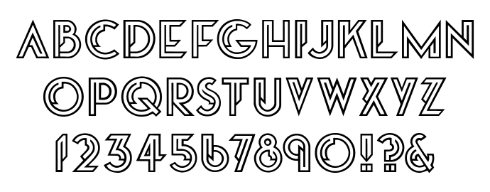
Garbo
Designer
Gary Cooke
Date
1975
Foundry
Digital
Greta by Dan X. Solo
Specimens
- Mecanorma Graphic Book 9 (61)
- Mecanorma Graphic Book 14 (121)
- Moderne Alphabets 100 Complete Fonts (23)
- Typony Core 4 (161 *Crank Open)
★

Garbo
Designer
Gary Cooke
Date
1975
Foundry
Digital
Greta by Dan X. Solo
Specimens


Mecanorma のコンペに応募するため、学生だったゲイリー・クックがはじめてデザインした書体。 Typony Core 6 (71) に Crank という類似書体が掲載されている。
以下 cookewithane.com より引用。
I designed my first typeface (Garbo), when I was a student – it won an international typeface competition organised by Mecanorma. From that moment I fell in love with type.
As a packaging designer in the 80s many of the products I designed incorporated bespoke typography, although rarely was a full font designed. For the corporate world, big brands and advertising campaigns, a specially created typeface can really differentiate you from your competitors.
I have designed many typefaces for clients that are as unique as they are.
Making a comeback
Garbo, the typeface I designed as a student back in the seventies seems to be appearing in the coolest places! On the über cool Swedish fashion magazine Bon, where it's used as their masthead and twice (one a variation of) on the V&A Bowie Poster.
cookewithane.com/what/typography
BON Magazine Logo